The Swiss Army Knife of Design. For the past two years at Your Navi, I have been a versatile specialist, seamlessly balancing UX and UI tasks. My role involved user testing, prototyping, and wireframing, but I also optimized workflows, coordinated cross-department communication, and occasionally worked on Webflow development.
About the Company
YourNavi is a SaaS platform helping users compare and manage telecom plans across U.S. carriers. As the product evolved, the platform required scalable UX architecture and support for B2B carrier integrations.
My Role in the Project
Over the past two years, I have been deeply involved in multiple areas of the project:
UX Research, Prototyping, and Testing – conducted user studies to enhance platform usability
Implementation & Collaboration – worked closely with developers, product owners and CEO to introduce new solutions and align expectations
Built and maintained a scalable design system, ensuring consistency across the product while documenting design tokens and guidelines
My work at Your Navi focused on making the user journey smoother, improving plan comparison tools, and ensuring a seamless experience from onboarding to final selection.
Work Examples
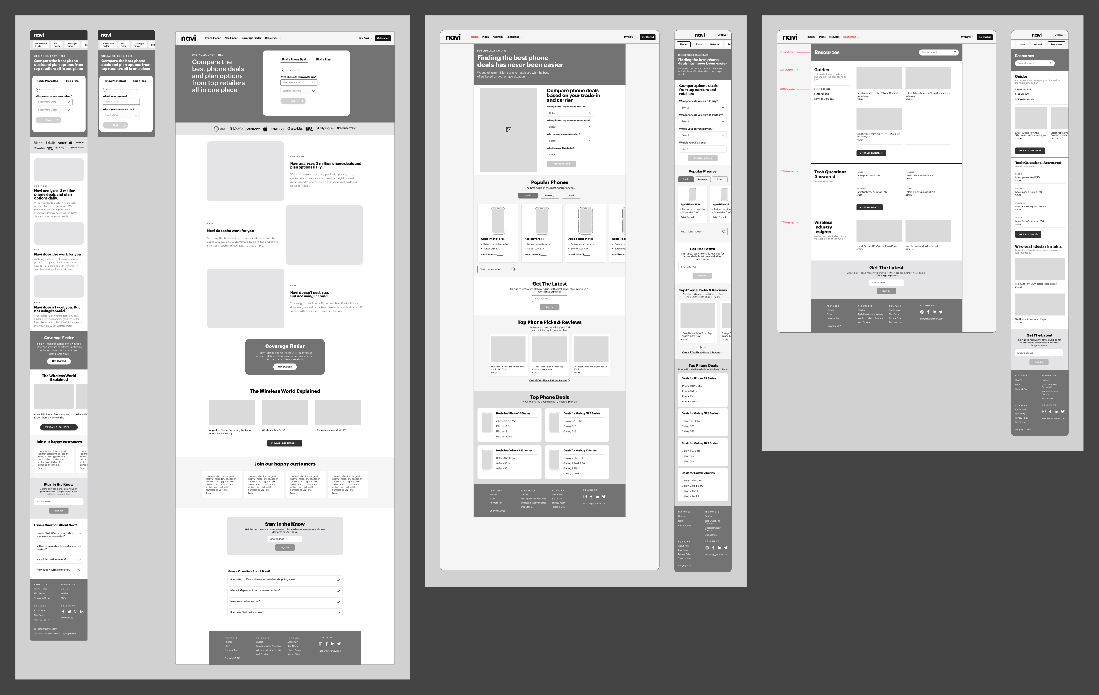
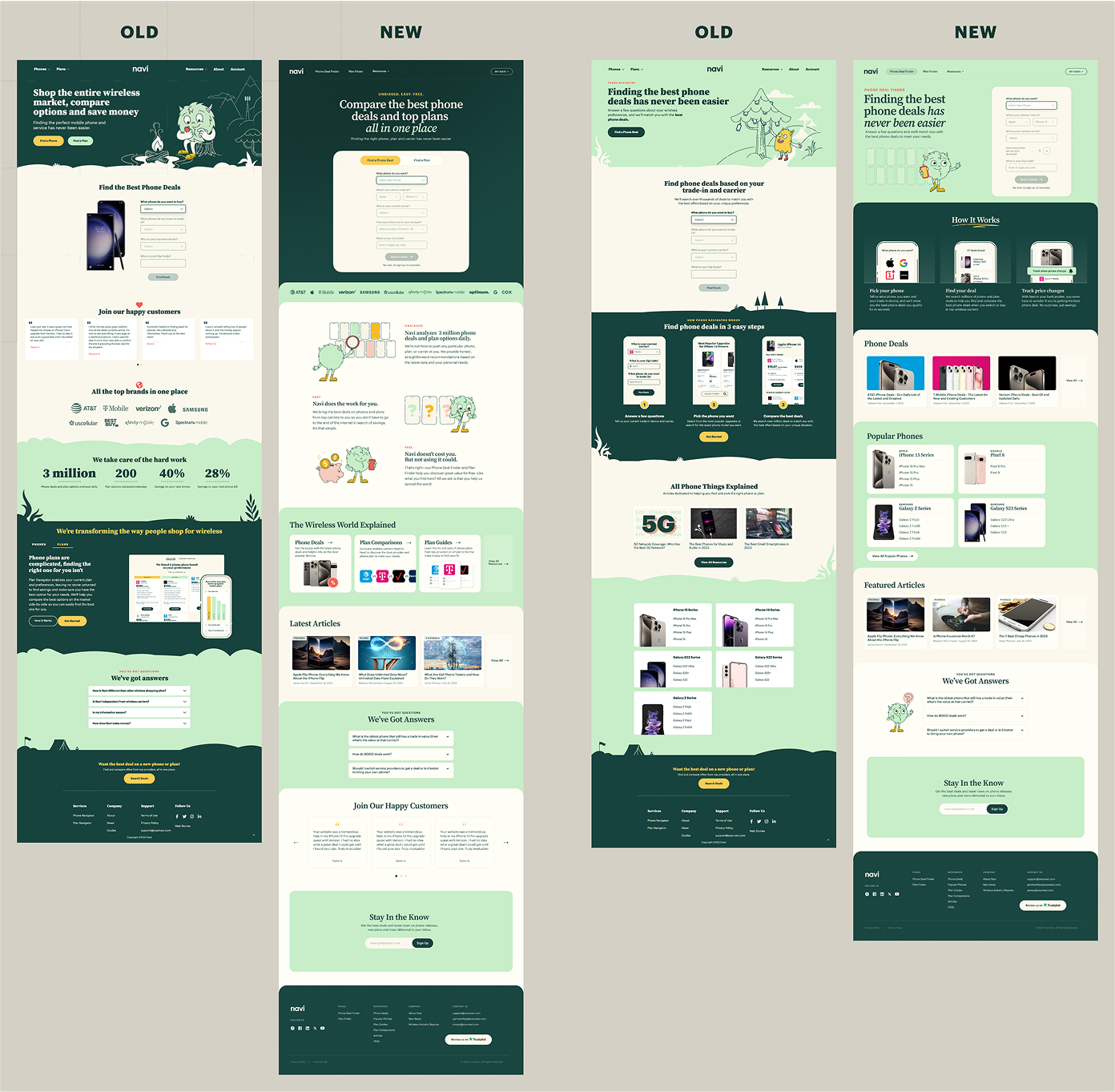
Marketing Website Redesign
Challenge
The company needed a modernized visual identity for its marketing website while ensuring scalability for future updates. Additionally, the design team required a structured UI system to improve efficiency and collaboration.
Approach
Step 1: Stakeholder Interviews
The company needed a modernized visual identity for its marketing website while ensuring scalability for future updates.
Additionally, the design team required a structured UI system to improve efficiency and collaboration.
Step 2: User Testing & Competitive Analysis
To validate our new design direction, we conducted user testing with 15 participants, presenting different visual styles for the same user flow. 97% of participants preferred the updated version, confirming improved clarity and engagement.
At the same time, I conducted a competitive analysis, including:
SWOT Analysis – identifying areas of differentiation
Templates & Pages – full-page structures for rapid assembly
I adapted this approach to fit the project's needs, ensuring flexibility while maintaining consistency.
Step 5: Developer Handoff Optimization
I introduced Figma’s Dev Mode to the entire team and implemented a marker system ("Ready for Dev"), significantly accelerating the development & QA process.
Results & Impact
97% of tested users preferred the new UI (based on 15-user testing session)
UI updates cut design handoff time by 40% (Figma Dev Mode implementation helped speed up the development cycle)
Scalable design system reduced future design inconsistencies & maintenance time
B2B Carrier Solution for U.S. Carriers
Challenge
Our product owners saw an opportunity to expand our mobile app beyond just an independent plan comparison tool. Instead, we could customize it for specific carriers (Xfinity, COX, T-Mobile, etc.) and sell it as a software solution for their business needs.
Several potential B2B use cases were considered:
Support Tool – An internal tool for customer support agents to quickly analyze calls and recommend the best plans.
In-Store Tablet App – A customized application for retail stores, helping sales representatives suggest personalized plans.
Embedded Web App – A fully integrated widget on a carrier’s website, offering real-time plan comparisons with competitors.
Since we already had a working consumer-facing app, we decided to use it as a foundation while conducting UX research to identify gaps and necessary adjustments.
Approach & Process
Step 1: UX Research & Initial Concept Validation
I worked closely with Head of Design, Product Owner, and Data Analysts to determine key UX challenges and requirements. We held multiple brainstorming sessions, where I:
Filtered ideas & structured insights into actionable design goals
Created low-fidelity wireframes to visualize possible solutions
Iterated through several rounds of discussion to refine the core product structure
Main UX Debates:
Optimizing onboarding flow – What questions should we ask, in what sequence, and how would the data be used?
Ensuring a flexible framework – The app needed to work seamlessly across different carriers while maintaining core logic.
Once the onboarding flow was finalized, we designed the internal system architecture using the same structured approach.
Step 2: User Testing & Iteration
After defining the best possible product structure, we selected two UX flow variations and conducted usability testing on UserTesting with 10 participants.
Optimized onboarding questions based on user feedback
Refined navigation logic to ensure a seamless experience
Step 3: Design System & Figma Variables Implementation
Biggest Challenge – Synchronizing design, documentation, and development, as the core logic had to remain the same across all clients, while only the branding and UI would change.
Solution – I decided to explore Figma Variables (which had just been released at the time). After testing them on a smaller project, I realized they were the perfect fit for our needs.
Implementation:
Migrated the entire design system to Figma Variables
Developed a naming structure in collaboration with developers to ensure consistency
Allowed fast theme switching to preview the app in different carrier styles
Impact:
Enabled scalable, modular UI customization for B2B clients
Accelerated the white-labeling process, making carrier branding adjustments seamless
Step 4: Experimental Design Lab & A/B Testing
Alongside the main B2B product development, we launched an internal "Design Lab" to experiment with new UI styles & tone-of-voice approaches.
Why? Since the product was B2B under NDA, we needed a way to test UI/UX hypotheses without exposing our brand.
How? Working with data analysts & developers, we implemented Amplitude event tracking to measure the impact of various design changes.
Key Takeaways:
Tested alternative branding approaches while maintaining usability
Gained data-driven insights into design changes & their business impact
Strengthened cross-team collaboration (design + data + development)
Results & Impact
Scalable B2B product with a fully modular design system
Fast theme switching via Figma Variables for carrier customization
Optimized onboarding UX, validated through user testing & data analytics
Innovative A/B testing approach via the internal Design Lab
Final Thoughts
This project transformed our consumer app into a scalable B2B product
Figma Variables proved to be a game-changer for white-label customization
Data-driven design decisions helped improve usability and product adoption
Team Feedback
Vita Levchenko – Head of Design
I've had the pleasure of working with Oleksandr for almost 2 years at Navi. His creative approach to UI design is consistently impressive. What sets him apart is how he combines fresh design perspectives with a solid understanding of UX principles and front-end development.
This technical knowledge has contributed to the team's success, allowing him to communicate design requirements clearly and collaborate effectively throughout implementation. His adaptability is remarkable - he quickly adjusts to changing priorities while maintaining his positive attitude.
Ihor Kobylinskyi – Team Lead
Oleksandr is a proactive UI/UX designer with a good understanding of design tools and workflows. He effectively uses technical features like variables in Figma to improve efficiency and maintain consistency.
He communicates well with developers, making handoffs smoother and ensuring that designs are implemented as intended. His experience with Agile helps him stay flexible and keep work processes organized.
I enjoy working with Oleksandr and appreciate his structured approach and attention to detail.